


Design Process
Branding


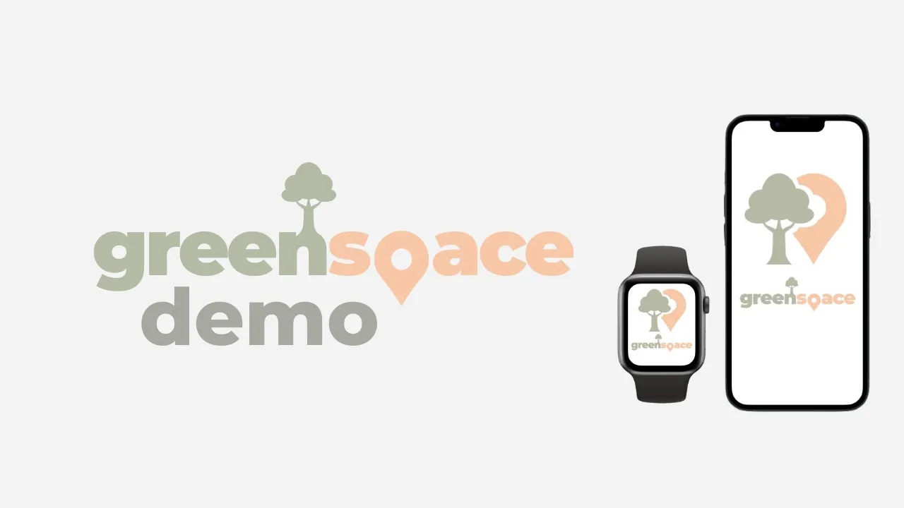
To tie the project together we designed some branding using the pastel green and orange from our app to have a softer, calming appeal compared to sharper colours. Playing around with the logo through combinations of trees and navigation markers merging.


Demo Video

Project Overview
Greenspace is a collaborative project working with a fellow Interaction Designer to create a live feedback app designed to encourage those to get outdoors. Targeted at specific groups of people categorized into extroverts and introverts, providing solutions to match the type of person you are. With the inclusion of Googles popular time algorithm to best help determine times for each segment of the app and to provide reliable and steady information. This app is designed to help users mental health and to re-introduce people into the outdoors, particularly after COVID-19.
Brief
How might we design a digital platform to find, create and share spaces that are safe, trusted and offer protection?
Screen Design
Layouts of both introvert and extrovert options on app.
During COVID-19 getting fresh air in public spaces and outside activities were very limited. We wanted to create an app that encouraged extroverts and introverts alike to get back into the outdoors and enjoy the space around them. A key component we wanted to include was Googles live feedback algorithm to better help determine the best options for people who prefer social, loud spaces and people preferring quieter spaces.
Through paper frames we mapped our four main features included in the app with simple interactions to create a smooth and simple way to move about in the app.
The paper prototypes gave us insights into layouts and appearance with both a phone and watch. Taking these insights, we moved the prototypes over into Figma where we encountered our first main issue of screen size and the information we were trying to display.
User testing showed more explanation of the graphs, and the scrolling feature was needed due to the information being unclear or they just didn’t notice the features were there.